
A Look Inside: Painting the Town

June 2025Color me impressed: this new volume from Preservation Resource Center celebrates the many hues of the Crescent City’s architecture.
– by John S. Sledge

This column is underwritten in part by Karen Hinton & Howard Glaser
Like everything else that it does, The Preservation Resource Center’s new book, Painting the Town: The Importance of Color in New Orleans Architecture ($39.95) is a triumph. Featuring stunning photographs by award-winning photojournalist Chris Granger accompanied by polished essays by professionals like Center executive director Danielle Del Sol, architectural historian Sally K. Reeves, preservation consultant Michelle Stanard Duhon, journalist John Pope, and others, the volume is an altogether lovely hymn to the rich tradition of color in New Orleans’ built environment.
In the foreword, Del Sol evokes the Crescent City’s polychromatic backdrop: “Greens, oranges, pinks, and whites. Blues so deep you want to dive into them. Reds that radiate in the sun. New Orleans explodes in color. Verdant foliage and bright buildings provide a palette that is to show off, to say, unabashedly, we are a place like nowhere else.”

Click here to purchase from Preservation Resource Center
Why is this so, she asks, “and why, today, some 300 years after its founding, do we still embrace such vibrancy?”
Painting the Town is Del Sol and her colleagues’ attempt to answer these questions. According to Michelle Stanard Duhon in her essay, “The Geography of Color,” historically color choice was more than just personal preference: “chemistry, pigment availability, and cultural influences all played a role.”
In her essay titled “An unparalleled resource,” Sally K. Reeves explains how the Notarial Archives in the Clerk of Civil District Court help document exactly what colors past New Orleanians used to protect and distinguish their buildings. Among its holdings are over 5,000 “engineer’s scale” (one inch to 23 feet) watercolor paintings of buildings dating between 1803-1918.
Produced by trained surveyors, engineers, and sometimes architects, these lovely, outsized sheets advertised property sales. Each one shows the relevant block with street names, landscaping, a site plan, a floorplan, and a color elevation of the building. Records at The Historic New Orleans Collection and at Tulane University’s Southeastern Architectural Archives also contain valuable material for sleuthing paint schemes.
Diverse colors defined New Orleans’ different periods, and each ethnic group had its preferences. According to Duhon, Spanish buildings displayed stuccoes in a variety of earth tones, reds, oranges, and pinks. The Creoles used “bright, bold color palettes,” whereas the Americans (or Kaintucks, as the locals disdainfully called them) gravitated to whites and neutral shades for their Greek Revival buildings.
Green shutters were practically universal, however. According to Duhon, green was the first “commercially available pre-mixed paint color in the United States, created in 1880 as ‘Shade K’ by Sherwin Williams.” But as early as 1820, locals had adopted a very dark, almost black, variety called verdigris, commonly referred to these days as French Quarter Green (and in Mobile as Bellingrath Green).

Photograph by Chris Granger
Of course, as every preservationist knows, paint analysis—that is, the careful scraping away and examination of earlier layers on clapboarding, gingerbread, baseboards, moldings, door frames, and the like —provides foolproof evidence of paint color.
Duhon explains that paint analysis “defines a color in terms of its chroma, value, and hue.’’ Chroma is the pigment’s intensity; value, its degree of lightness or darkness; and hue, the actual color, i.e., red, blue, etc.

Photograph by Chris Granger
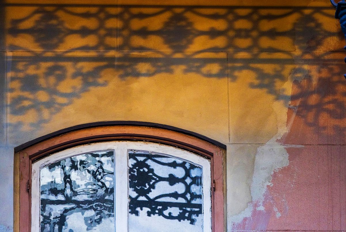
Photo by Chris Granger
Since the French Quarter is the only one of New Orleans’ historic districts where paint color is regulated, such precise information is vital to the approval process. Interestingly, the Quarter’s most requested exterior house color is black, for which there is no historic evidence. Such requests are routinely denied.
The book’s other essays include an interview with Louis Aubert, the so-called “color guru,” by Susan Langenhennig of the PRC. Aubert advised on Gallier Hall’s interior color scheme during its recent three-year restoration, meticulously researching its color history. He is more relaxed when working with the owners of non-landmark buildings, however. “I don’t inflict historic colors on anyone,” he laughs, “but I do believe in being respectful to the house.”

Photo by Chris Granger

Photo by Chris Granger
John Pope contributes an entertaining history of K&B’s iconic purple logo, first used in 1911, and the volume concludes with short essays on color at the Dodwell House, the Beauregard-Keyes House, and 1239 First Street, as well as in local cemeteries. These last suitably spooky locales feature “stately white and faded gray above-ground crypts,” as well as sun-faded and rain-washed reds, pinks, and blues on the cracked stucco surfaces of numerous tombs.
The essays are well-written and informative, but Granger’s photographs dominate, and they are a glory. His appreciation for architectural nuance is superb, as demonstrated by shots of elegant ironwork, florid gingerbread porches, dormer and window details, and buildings foregrounded by urban infrastructure, tropical foliage, and costumed passersby.
Throughout the volume his eye for color is breathtaking—a white and turquoise pediment etched against a cerulean sky; the Pepto Bismol pink Cry Baby Floral store; and a bright green house with blue columns, yellow trim, and a red door. He intersperses this architectural imagery with theme shots that are quintessentially Crescent City—a man savoring a chilled glass of Pimm’s No. 1, a mess of blue crabs, a platter of shrimp, a Tchoupitoulas Street sign enveloped by Confederate jasmine, and a sack of beignets well powdered.

Photo by Chris Granger

Photo by Chris Granger

Photo by Chris Granger
In addition to its substantive and beautiful contents, Painting the Town is a fine example of quality bookmaking – all too rare these days. At 8 by 10 inches, it is a bit smaller than most coffee table books and consequently easy to hold. Heavy paper stock, Smyth-sewn binding, and flawless print quality make it a pleasure to browse.
Taken in toto, this volume is sure to please any Crescent City lover.